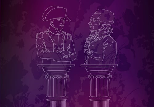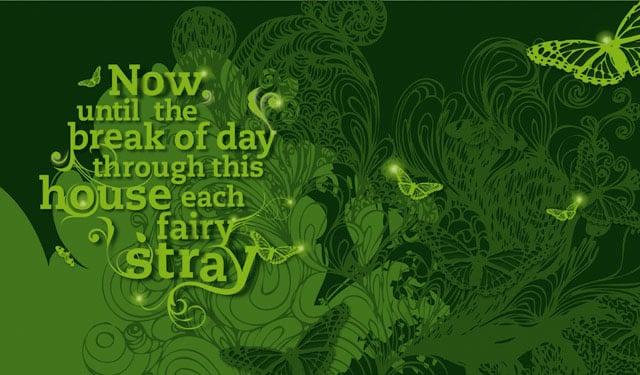
SchriftStueck – Zitatillustration

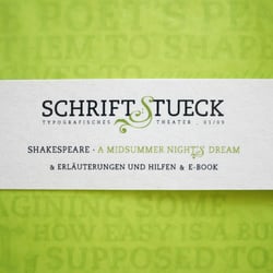
„Schriftstueck“ ist ein Magazin für klassische Theaterliteratur, dass es sich zur Aufgabe macht, Theaterstücke typografisch zeitgemäß zu interpretieren. Dies findet in Form von ansprechender Lesetypografie und Inszenierungen statt, ohne dabei den Inhalt zu verändern oder zu verfälschen.
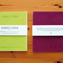
Ziel des Magazins ist es, neuen Leseanreiz zu geben und die Texte so wieder interessant zu machen. Schriftstueck besteht aus drei Teilen: Dem jeweiligen Stück der Ausgabe, Erläuterungen und Hilfen zum Stück und dem digitalen E-Book mit animierten Szenen zur Nutzung am Computer.
SchriftStueck – Zitatillustration
SchriftStueck
SchriftStueck
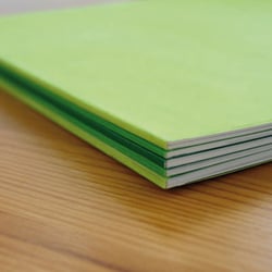
SchriftStueck – Einband nach Akten
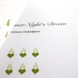
SchriftStueck
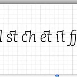
SchriftStueck – Ligaturen
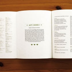
SchriftStueck
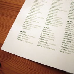
SchriftStueck – Vokabelhilfe je Akt
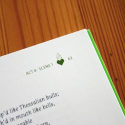
SchriftStueck
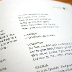
SchriftStueck
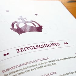
SchriftStueck Erläuterungsheft
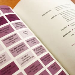
SchriftStueck Erläuterungsheft
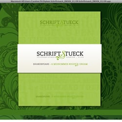
SchriftStueck – eBook
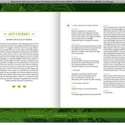
SchriftStueck – eBook
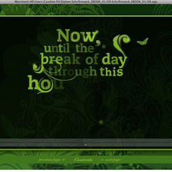
SchriftStueck – eBook Animation
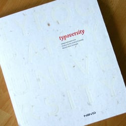
SchriftStueck – Publikation in Typoversity
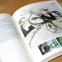
SchriftStueck – Publikation in Typoversity
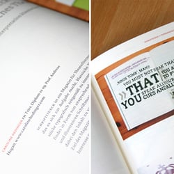
SchriftStueck – Publikation in Typoversity